Color Theory for Knitters & Crocheters: A Complete Guide
Do you ever wonder why some knitting or crochet projects look effortlessly beautiful while others feel “off”? The secret often lies in color theory. Understanding how colors work together will help you create stunning yarn palettes and elevate your handmade projects.
In this guide, KnitPal walks you through the essentials of color theory for knitters and crocheters — from the basics of hue, tint, tone, and shade, to practical tips for choosing yarn colors that work in harmony.

What is color theory?
Color theory basically encompasses the ways in which color is used, for example, in design. Color Matter notes that “there are three basic categories of color theory that are logical and useful : The color wheel, color harmony, and the context of how colors are used”
In this article we’ll first look at primary, secondary, and tertiary colors and what they are, before moving on to the color wheel and how you can use one when designing your own knitting and crochet project color schemes.

Why Color Theory Matters in Knitting & Crochet
Colors influence mood, style, and the overall look of your projects. Choosing the right color combinations can:
-
Make stitch patterns more visible
-
Highlight design details
-
Enhance wearability and versatility
-
Create harmony or bold contrast, depending on your vision
👉 Looking for yarn inspiration? Explore KnitPal’s yarn collections for solid and gradient shades perfect for experimenting with palettes.
The Basics: Hue, Tint, Tone & Shade
-
Hue: The pure form of a color (red, blue, yellow).
-
Tint: Adding white to a hue to make it lighter (e.g., baby blue).
-
Tone: Adding gray to soften the color (e.g., dusty rose).
-
Shade: Adding black to darken the color (e.g., navy blue).
✨ Pro Tip: Knit a small swatch of your yarn choice to see how these variations play out under natural and indoor lighting.
Understanding the Color Wheel
The color wheel is a powerful tool for designing projects.
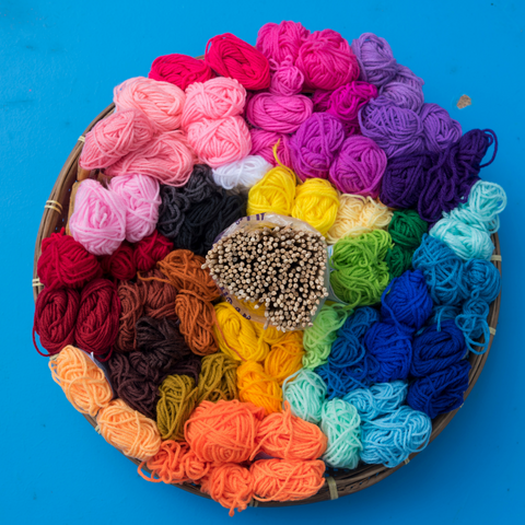
The color wheel – they can easily be bought at your local arts and crafts store – is made up of a circle that includes all the colours we’ve already covered, and usually many more as well.
-
Primary Colors: Red, blue, yellow
-
Secondary Colors: Orange, green, purple
-
Tertiary Colors: Combinations like teal, magenta, chartreuse
-
Warm vs. Cool: Warm colors (reds, oranges) feel cozy and bold, while cool colors (blues, greens) feel calming and fresh.
Together these make up the primary, secondary, and tertiary colors. Following this chart, colors that go together can quite easily be matched.


Popular Yarn Color Schemes
Monochromatic
Different shades, tints, or tones of one color (e.g., light blue, sky blue, navy).
Analogous
Three colors next to each other on the color wheel (e.g., green, teal, blue).
Complementary
Colors opposite each other on the wheel (e.g., purple + yellow). High contrast = bold look.
Triadic
Three colors evenly spaced on the wheel (e.g., red, blue, yellow). Balanced yet vibrant.
Tetradic (Double Complementary)
Two pairs of complementary colors (e.g., green + red, blue + orange). Complex but exciting.
Tools to Help Choose Color Palettes
-
Coolors.co – Generate 5-color palettes instantly.
-
Paletton – Explore advanced schemes interactively.
-
Colormind – AI-powered palettes from images.
👉 Tip: Upload a photo of your inspiration object (flowers, fabric, landscape) and let the tool build a matching palette. Then map those to KnitPal’s yarn colors.
Common Color Mistakes to Avoid
-
Pairing too many bold shades without neutrals
-
Ignoring how yarn colors look under different lights
-
Overloading with more than 3–4 main colors
-
Forgetting that textured stitches also affect how colors interact
✅ Always knit a test swatch before committing to a large project.
Step-by-Step: Choosing Yarn Colors
-
Pick your dominant color (the base yarn).
-
Add secondary color(s) for harmony or contrast.
-
Include neutrals or accents (white, gray, black, beige).
-
Knit a swatch to test.
-
Adjust as needed until the combination feels right.
Frequently Asked Questions (FAQ)
Q: Can I mix warm and cool colors in one project?
Yes! Just balance them with a neutral to avoid clashing.
Q: How many colors should I use in a single project?
For most knitting or crochet projects, 2–4 colors create balance without overwhelm.
Q: What’s the easiest palette for beginners?
Analogous palettes (neighboring colors on the wheel) are simple and almost always harmonious.
Q: How do I make a project “pop”?
Use a complementary color as an accent — for example, a mustard stripe against navy.
Share Your Color Creations
We’d love to see your color-theory projects! Share your swatches, WIPs, and finished pieces with us on Instagram @KnitPal or join our KnitPal community.
Final Thoughts
Understanding color theory for knitting and crochet helps transform your yarn choices into beautiful, professional-looking projects. Whether you want subtle harmony or bold contrast, these principles guide you in creating the perfect palette.
👉 Ready to experiment? Shop KnitPal’s yarns in dozens of vibrant shades and put your new color skills to the test!
